PICKLE PARADISE
Pickle Paradise is a premium direct-to-consumer (D2C) eCommerce website designed to make ordering authentic homemade pickles simple, fast, and enjoyable. The platform showcases a clean, modern interface with high-quality product photography, detailed product pages, customer reviews, and a seamless shopping experience. Customers can easily browse products, select sizes and quantities, add items to their cart, and place orders directly through the website

Pickle Paradise is an artisan direct-to-consumer (D2C) food brand engineered to elevate traditional regional pickle purchasing into a frictionless, high-conversion online shopping journey[cite: 1]. By replacing fragmented offline sales channels and informal order management with a responsive, media-rich web application, the platform unifies product discovery, size selection, dynamic cart interactions, and simplified checkout into one cohesive digital flagship[cite: 1]. Visit the live website to explore the complete shopping experience at https://www.pickleparadise.org/.
Digitizing Specialty Food.
Specialty and artisan food producers historically face severe operational ceilings when relying solely on physical storefronts, local markets, or manual messaging-based orders. These offline-first sales models restrict customer reach to immediate physical geographies, introduce high manual overhead for order collection, and create significant friction for returning buyers seeking repeat purchases.
The Digital Opportunity: Transitioning a culinary product into a direct-to-consumer digital environment requires establishing immediate brand authority and sensory resonance without physical tasting. The online experience for Pickle Paradise was designed to bridge this sensory gap through high-definition product photography, clear ingredient transparency, transparent customer reviews, and a streamlined purchasing pipeline[cite: 1].
By establishing a direct web channel, Pickle Paradise eliminates marketplace dependency, captures first-party customer relationships, and scales direct fulfillment capacity across broader consumer demographics. Experience the premium product showcase and ordering flow on the official website.
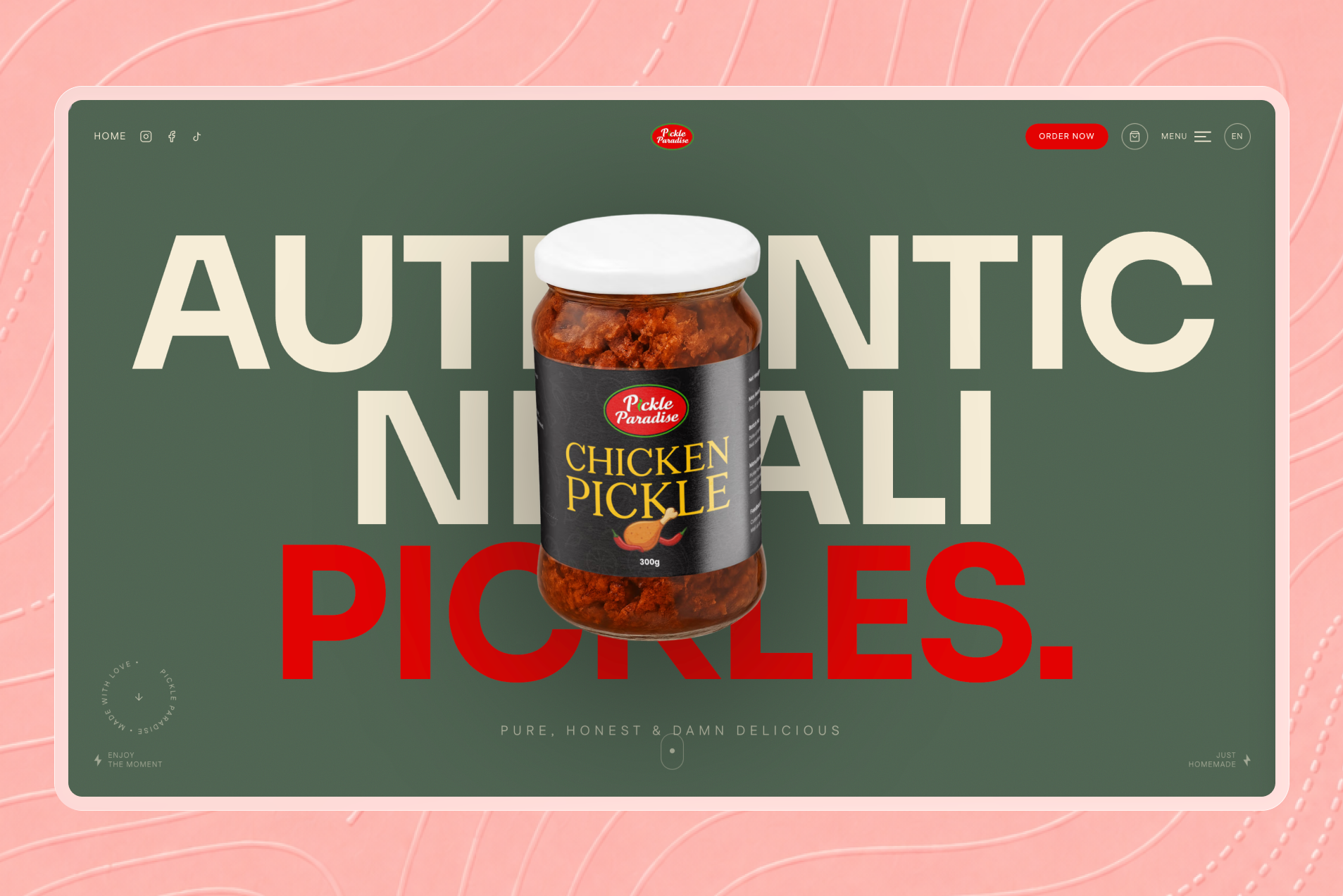
Eliminating Buying Friction.
Small-scale specialty food brands consistently battle systemic conversion barriers when entering digital commerce. Traditional challenges include low brand visibility, weak visual identity, clunky mobile navigation, and opaque fulfillment communication—factors that quickly undermine consumer trust during initial store visits.
Specific Friction Points Solved:
1. Offline & Manual Dependencies: Relying on phone calls or social media direct messages for orders creates severe bottlenecks, causes dropped sales during non-business hours, and leads to inventory tracking errors.
2. Sensory & Quality Anxiety: Unlike physical grocery shopping where buyers inspect labels and packaging, online food buyers require robust social proof, detailed flavor profiles, and explicit weight/size options to confirm purchase decisions.
3. Mobile Checkout Drop-off: Complex multi-step checkout funnels and slow page load times lead to abandoned carts, particularly among busy professionals browsing on mobile devices.
Core Objectives.
The UX strategy and architectural decisions for the Pickle Paradise platform were driven by clear business and usability benchmarks:
- Accelerate Product Discovery: Structure navigation and visual cards so users can scan, filter, and inspect flavor profiles within seconds of landing on the site.
- Establish Premium Trust Signals: Embed verified customer reviews, clear contact information, and transparent policy guarantees prominently throughout the user journey[cite: 1].
- Optimize Mobile Commerce: Engineer touch-friendly controls, full-width product imagery, and slide-in drawer carts specifically optimized for handheld viewports.
- Maximize Conversion Rate: Minimize clicks from landing to order confirmation through persistent calls-to-action and a simple, low-friction checkout flow[cite: 1].
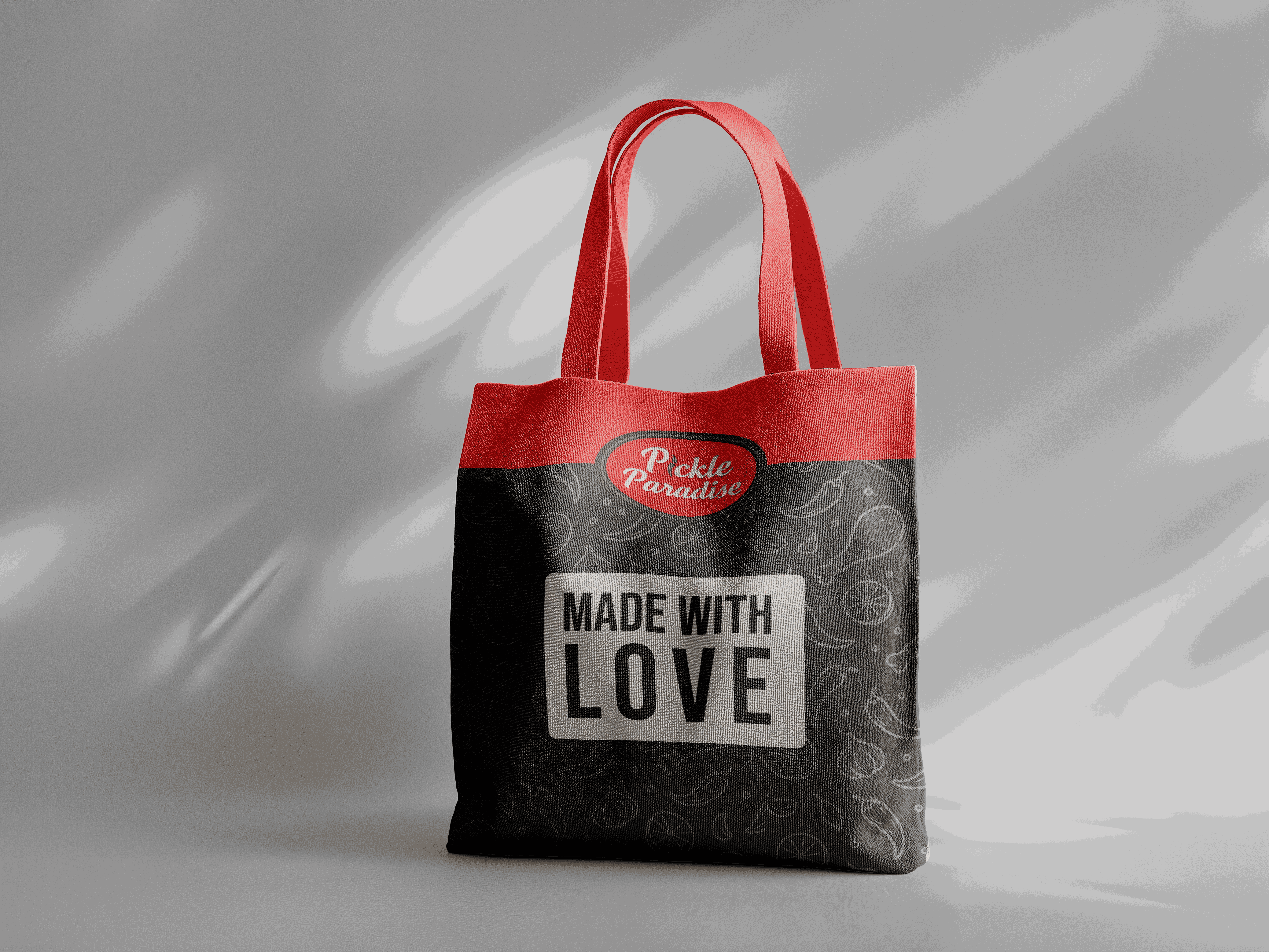
Target Audience Insights.
Research into specialty D2C food buyers identified four primary user archetypes, each with distinct expectations, motivations, and purchasing behaviors:
1. The Busy Working Professional: Values speed, frictionless mobile navigation, and rapid checkout options. Expects clear weight options, transparent pricing, and instant order confirmation without unnecessary account creation steps.
2. The Culinary Enthusiast: Highly focused on product detail pages, ingredient lists, flavor profiles, and authentic customer reviews. Willing to pay a premium for artisan quality when backed by strong visual proof and brand storytelling.
3. The Gift & Special Occasion Buyer: Seeks curated packaging, multi-item bundles, and trustworthy contact/support channels to ensure reliable delivery times for family and friends.
4. The Returning Household Buyer: Prioritizes rapid re-ordering capabilities, straightforward cart management, and consistent product availability.
Structured Navigation.
The site hierarchy avoids deep multi-level submenus, maintaining a shallow, accessible layout that keeps product inventory within immediate reach:
Core Map Hierarchy:
- Header / Navigation: Brand Logo, Product Catalog Links, About, Contact, and Persistent Cart Trigger.
- Homepage (Flagship Showcase): Hero Value Proposition, Curated Featured Products, Brand Story, Customer Testimonials, Contact Hub.
- Product Catalog & Details: High-Resolution Image Galleries, Weight/Size Variants, Quantity Selector, Add-to-Cart / Buy Now Actions, Detailed Descriptions.
- Slide-in Cart Drawer: Live Item Count, Subtotal Summary, Quantity Adjustments, Direct Checkout Action.
- Checkout Funnel: Simplified Address Form, Secure Payment Options, Order Confirmation.

Visual Harmony.
The visual system balances warm, food-safe aesthetic tones with clean, modern eCommerce UI patterns. Generous white space and structured card containers frame vibrant product photography, ensuring the food itself remains the focal point of the page.
Buttons feature rounded geometry with high-contrast background fill to ensure primary calls-to-action stand out clearly against neutral canvas backgrounds. Card layouts utilize soft subtle drop-shadows and subtle elevation states on hover, providing clear tactile affordances for desktop and mobile touch interactions alike.
Typography relies on a clean, accessible sans-serif hierarchy that scales predictably from desktop displays down to mobile screens, prioritizing quick scanability for ingredient labels, pricing, and customer reviews[cite: 1]. Browse the complete product catalog on the official website to experience the visual layout firsthand.
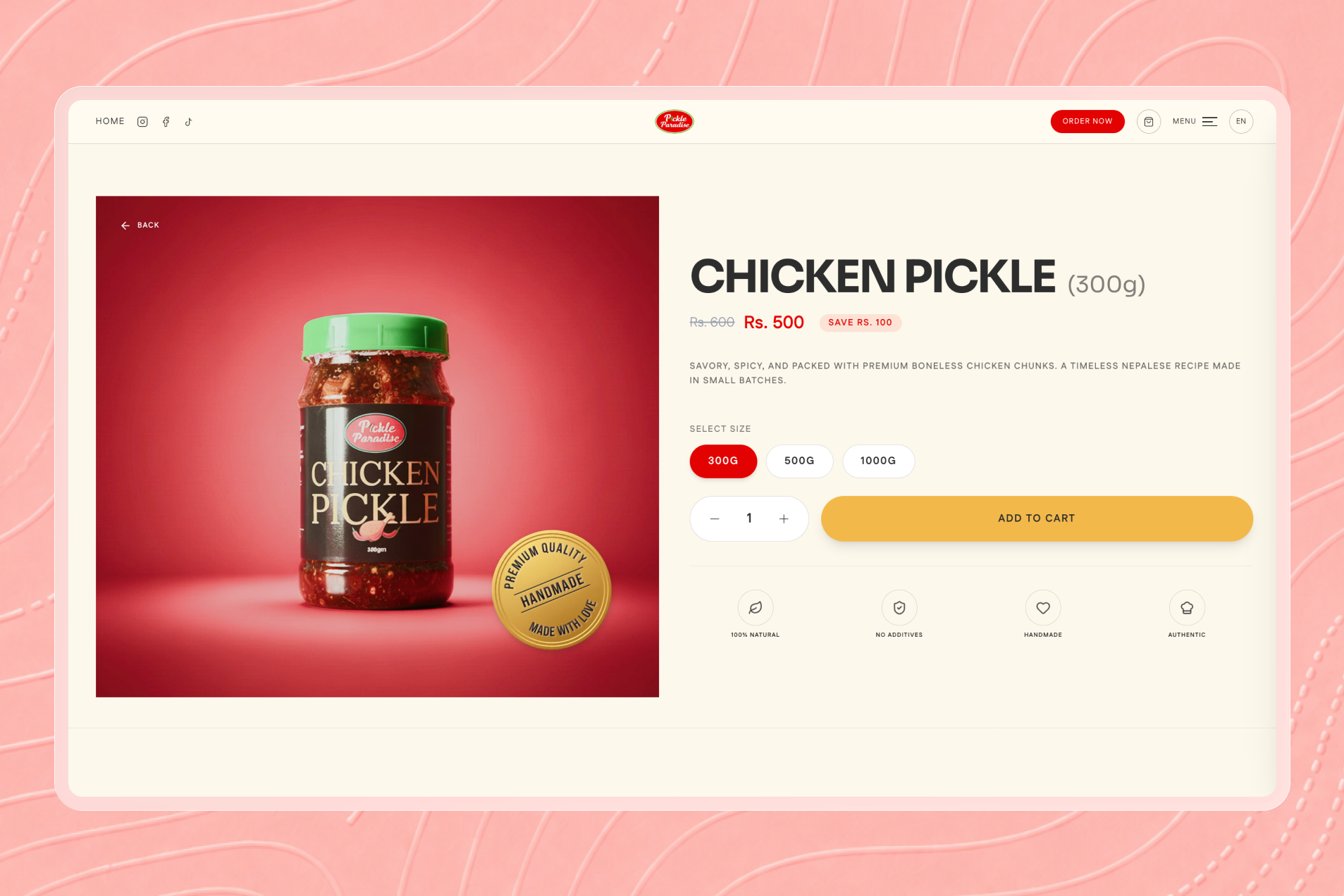
Product Detail Page UX.
The Product Detail Page (PDP) is structured as a dedicated decision engine, systematically addressing buyer questions before they create hesitation[cite: 1]:
1. High-Impact Image Gallery
Large, professionally color-graded photography displays texture, marinade clarity, and packaging details. High resolution allows users to zoom and inspect jar quality, substituting for the physical senses.
2. Clear Pricing & Weight Variant Controls
Weight choices (e.g., 250g, 500g, 1kg options) are styled as distinct radio buttons or pills, allowing users to toggle sizes and instantly see real-time price updates. Discount indicators clearly emphasize promotional value when applicable.
3. Dual Primary Actions ('Add to Cart' & 'Buy Now')
Primary action buttons are prominent and visually prioritized. The 'Add to Cart' action opens an instant side drawer without refreshing the page, while 'Buy Now' accelerates high-intent shoppers straight into the checkout flow[cite: 1].
Slide-in Cart & Checkout.
Redirecting buyers to a separate cart page creates unnecessary navigation friction and increases drop-off risk. Pickle Paradise resolves this using a responsive slide-in cart drawer.
Slide-In Cart Benefits:
- Contextual Continuity: Users remain on their active browsing view while confirming item additions, keeping them engaged with product exploration.
- Instant Quantity Management: Dynamic `+` and `-` controls allow inline quantity changes with instant subtotal re-calculation.
- Direct Checkout Pathway: A prominent, sticky checkout trigger at the bottom of the cart panel provides a clear, uninterrupted route to payment[cite: 1].
The checkout interface simplifies input fields to the essentials, eliminating unnecessary form fields, offering guest checkout options, and displaying transparent shipping rates to maintain buyer confidence[cite: 1].
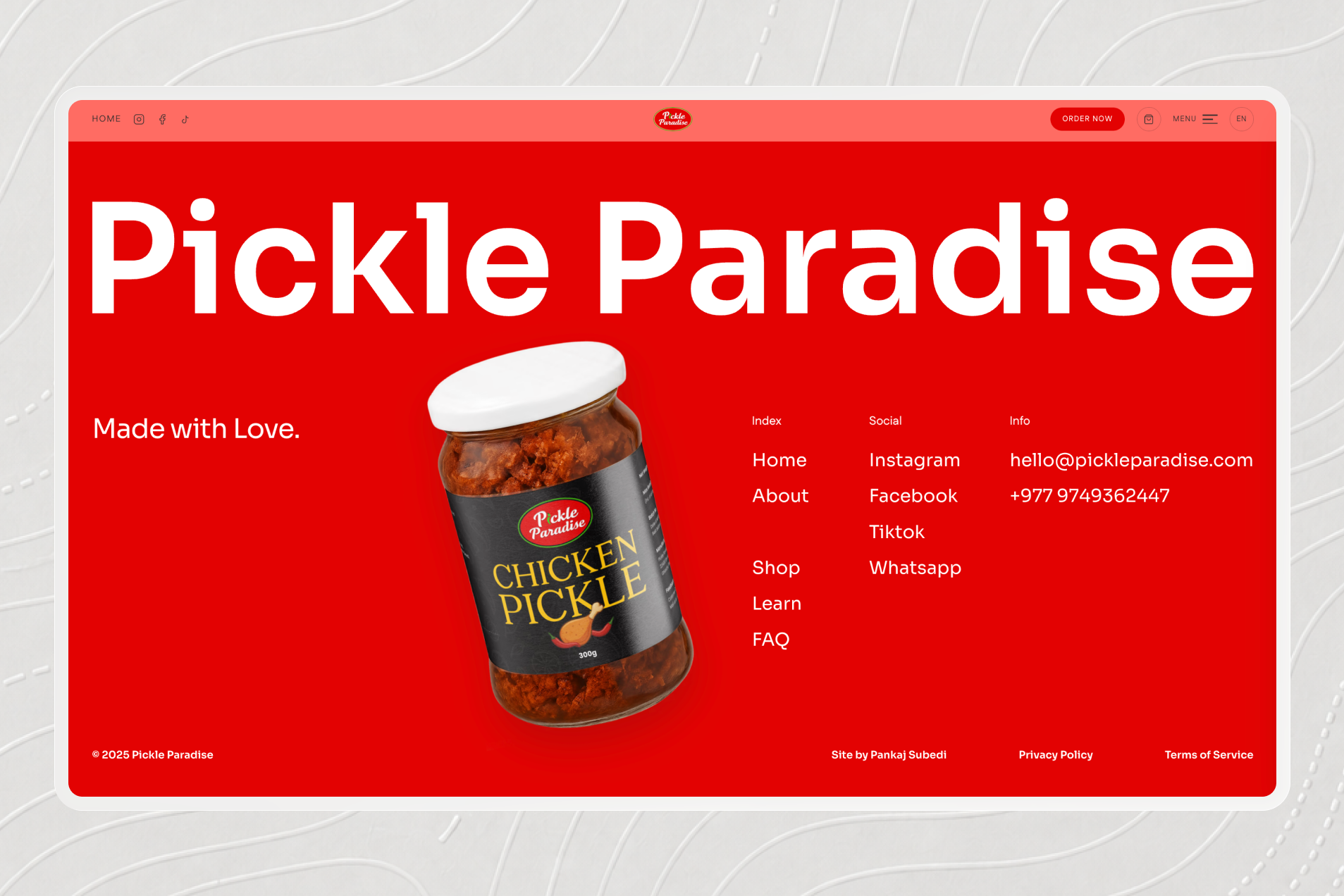
Social Proof & Support.
For an artisan food brand, social proof directly dictates conversion rates. Pickle Paradise embeds genuine customer reviews and ratings directly into primary landing views and product pages, confirming taste quality and delivery reliability[cite: 1].
Direct Support Access: A dedicated contact section provides accessible customer communication channels[cite: 1]. By offering direct inquiry options, clear contact details, and accessible support paths, the platform reassures hesitant first-time buyers and establishes strong brand credibility[cite: 1].
Frontend Excellence.
High-resolution food photography can significantly impact load times if unoptimized. The technical implementation of Pickle Paradise incorporates image optimization techniques, including responsive image sizing and lazy loading for off-screen assets.
Page layouts are built using modern responsive CSS (Flexbox and CSS Grid), ensuring fast render times and zero cumulative layout shift during image load. Clean, SEO-friendly HTML structures ensure product pages rank effectively for relevant culinary and specialty pickle queries.
Business Transformation.
The digital flagship for Pickle Paradise successfully modernizes the brand's sales pipeline, creating a foundation for direct customer acquisition and long-term business growth[cite: 1].
Key Qualitative Outcomes:
- Expanded Market Reach: Transitioned from localized, offline sales to a direct-to-consumer web presence accessible nationwide.
- Elevated Brand Perception: Professional photography, cohesive typography, and clean layouts position the brand as a premium specialty food choice[cite: 1].
- Reduced Operational Friction: Automated online cart management and structured checkout minimize manual ordering errors[cite: 1].
- Seamless Mobile Usability: Optimized touch targets and responsive cart drawers provide a modern shopping experience across all mobile viewports.
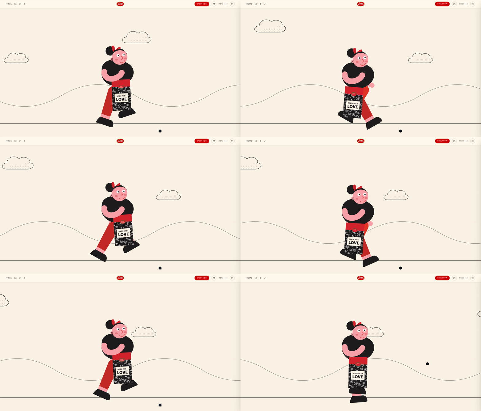
The Digital Flagship.
Pickle Paradise demonstrates how specialty food brands can successfully scale direct-to-consumer sales by prioritizing UX clarity, visual quality, and trust-building design choices[cite: 1]. By pairing high-impact product showcases with a seamless slide-in cart and simplified checkout flow, the platform establishes a high-conversion eCommerce foundation[cite: 1].
Experience the complete purchasing journey, explore product varieties, and discover the brand showcase directly on the live website at https://www.pickleparadise.org/.
"Pickle Paradise transforms artisan culinary heritage into a modern D2C eCommerce experience. By pairing rich product visual storytelling with a fast, frictionless slide-in cart, we created a digital flagship that turns visitors into repeat customers."[cite: 1] Design & Strategy Team, Pickle Paradise Case Study


Got a project
in mind?
Whether you need a custom web application, mobile app, UI/UX redesign, AI & automation workflows, or high-performance SEO, our engineering team is ready to build it.